The last few weeks have been murder on me. I had to send my camera body back to the shop. I can't stand it. I feel like a crack junkie looking for his next score in an Amish community. But it has given me a lot of time to think about the essentials of photography and why it is so important to occasionally go back to the basics.

A few months ago, someone approached me about how to get bette
r as a photographer. I was flattered and after the initial shock of wondering why they were asking me, I thought about how I
had started with a basic point and shoot camera. I handed her a $10 compact point and shoot 1 MP key chain camera from Walgreens. I said, "Here, work on your composition and get to know the camera." I think that went over like a lead balloon.
The point I was trying to make was that it is not about the settings I could show you on her camera, rather, it was about getting to know how a camera functions and then seeing how to frame your subject. I keep going back to these two points over and over in my own work. I constantly am asking my self, "How did you frame that, did you get the depth of field and focus you wanted, what IS the subject of this photo?"
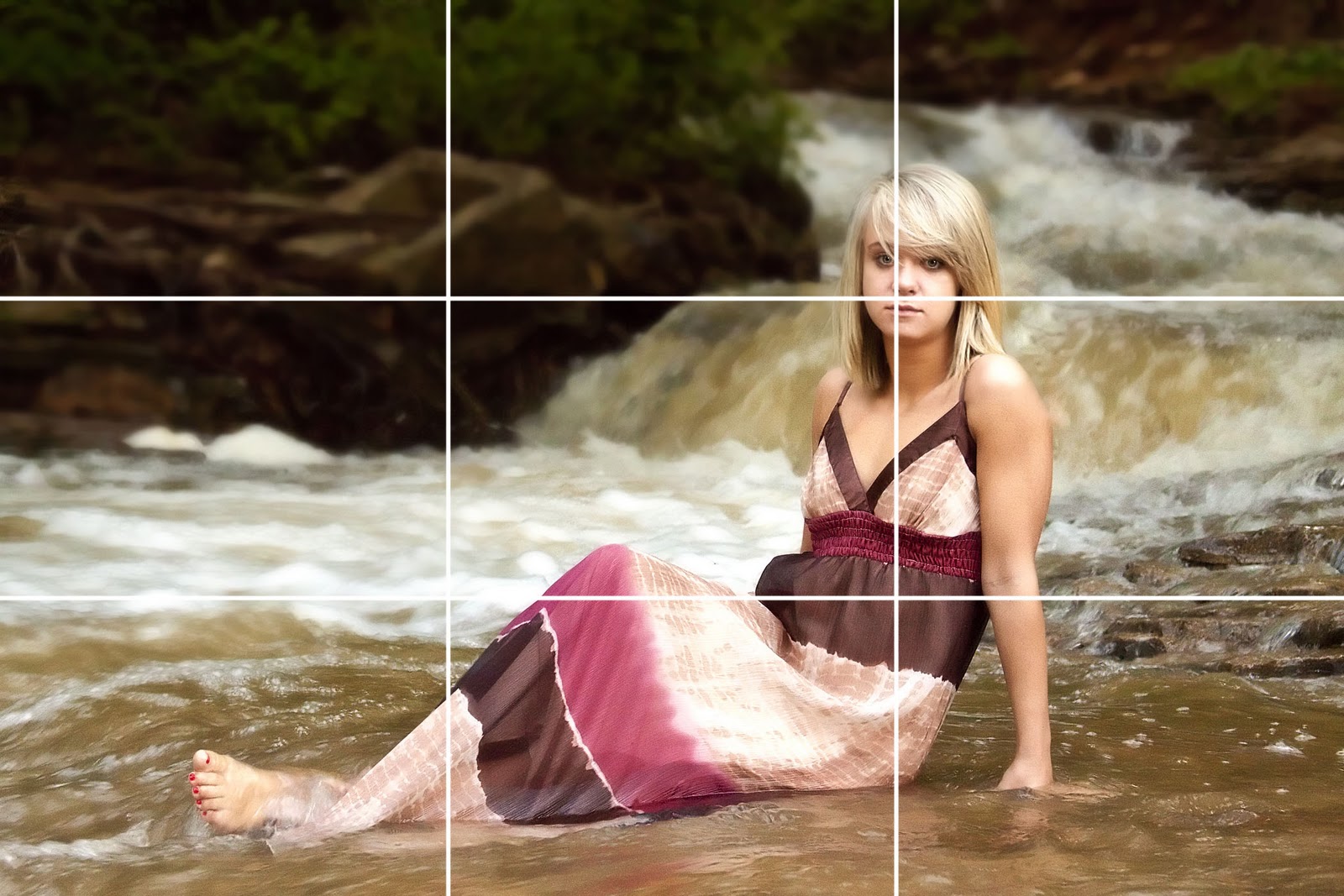
Let's start with composition, because you don't even have to have a camera to compose a photo, just a subject and something to record the image. For some odd reason our eyes are drawn to certain areas of a work of art. Usually, the upper right 3rd of anything. That's the rule of thirds.

There is something spiritual about it. And I don't say that all hippie-ish. God is made up of the holy trinity (3 pieces), 3 is a number of balance, etc. The rule of thirds splits an image into 3 sections vertically and horizontally with the intersections being the "sweet spots" of an image. It's a big tic-tac-toe board. The intersection in the upper right is the most pleasing. I've rarely gone wrong placing the closest eye of my subject in that intersection. Sometimes it is not possible, but when it is, it looks great.
This also has to do with pe
rspective, or the angle you take a picture. Children should have their image taken at their height. It looks better. Perspective adds drama. It gives a sense of falling or looking up or the expanse of the sky.
So far, we haven't even talked about technical settings for a camera. We've talked about composition. From a technical perspective, a camera takes light through a lens or opening and focuses it on a plane for recording.
A lot of people like to talk about depth of field or DOF. DOF is the blur you get in a background and a good portion of it is controlled by the aperture of your camera. What a lot of people don't understand is that's only half the story. You can get good depth of field with a larger aperture. What, how is that possible?
Here's the other half they aren't telling you. The closer you get to a subject and focus the more blurry the background will become. Take any point and shoot or snapshot camera and get really close to your subject. Click. What happens to the background? Blurred ... huh, how did that happen. Optics. Point and shoot cameras are about one step up from a pinhole camera. They don't have an aperture per se. But when you understand that the closer you get to a subject, the blurrier the background will get, it opens up a huge door.

I took this this morning with my very limited point and shoot camera. My cat allowed me to get close and the tree blurred. One or two steps back and the tree would have been in focus. My cat was kind enough to let me get about a foot from her.
My camera's lens is 36mm-108mm and f2.8-4.8. Not stellar by any stretch. Rather common. But using the settings that it comes with gives me options.
Using what you have is also essential. As I stated, the point and shoot doesn't offer me the ability to change lenses. Or does it?
We got to go to Galveston this summer. Usually, it's a trip my wife, mother in law and nieces and daughter take. I was pressed into service. I wasn't going to take an expensive camera to the beach. I took an old point and shoot.
I had been reading about being able to take a door peep hole and hold it in front of the camera and get a fish-eye effect. I bought a $5 peephole at Home Depot and instantly doubled my choice of lenses. I figured I needed a good polarizing filter as well, so I found an old pair of plastic sunglasses from Marshall for $6 and I had a polarizing filter.
It turned out what I was doing was using my resources to get an effect you have to pay high dollar for in camera shops. For less than $15 I had 2 lenses (peephole and the built in lens) and a filter. It wasn't so much that I was a super genius as it was knowing how a camera functions and what makes a good picture.
Enjoy the holidays.


 There is something spiritual about it. And I don't say that all hippie-ish. God is made up of the holy trinity (3 pieces), 3 is a number of balance, etc. The rule of thirds splits an image into 3 sections vertically and horizontally with the intersections being the "sweet spots" of an image. It's a big tic-tac-toe board. The intersection in the upper right is the most pleasing. I've rarely gone wrong placing the closest eye of my subject in that intersection. Sometimes it is not possible, but when it is, it looks great.


